Time-saving List Examples!

This is a great html/css list how–to I used back in 2005. It still is a great tutorial and set of examples.

I have to mention a great article and set of examples that really helped me tame a list navigation problem I was having on a website design I was working on at the time. I was trying to set apart a “current” item on a list as a visual cue as to what page the viewer is on. For example, if a viewer is on your home page, make the “Home” bullet on the list white with a white bar. I was able to come up with a solution, but ran into problems with, of all browsers, Camino. (This used to be a Mac–only browser that compete with Firefox.) Anyway, with my method, it set all visited bullets on the list as white with a white bar! I visited Digital Web Magazine (great site) which led me to CSSVault (another cool site). Finally, following a link from CSSVault, I came across the perfect solution to my problem on Max Design’s Listamatic. This solution, authored by Project Seven, worked perfectly with Camino, as well as with all of my other testing browsers. Thanks a lot Project Seven! And thanks a lot Listamatic!

For Better Type Display On PCs Using XP–ClearType

As a dedicated Mac user, I’m used to (i.e. spoiled by) the superior display technology that OSX gives me. And, as a web designer, I’ve always been frustrated by the pixelated, “jaggy” display of italic type on PC-based displays running Windows XP. Well, for those less familiar with the PC, here is a helpful (built–in!) little software utility by, gasp, Microsoft called ClearType that will help ban “the jaggies!”

Although this utility is built into Windows, it is set off by default. It also seems to me to be accessed in an almost “hidden” way, so you’re unlikely to run across it unless you are actually looking for it. To activate ClearType, access this FAQ and follow the instructions under “How do I turn it on?” The caveat is that you are not actually able to adjust ClearType settings with this method of activation. Its either on or off. Kind of bogus if you ask me.

Two better methods of ClearType activation that allow “tuning” of the settings are:

I personally prefer the latter. ClearType anti–aliases text, making “the jaggies” appear much smoother. Although designed primarily for laptop users with LCD displays, it also does a decent job at improving displays using traditional CRT (tube) displays. Be aware, though, that this is accomplished by decreasing edge sharpness, (i.e. blurring the edges of the characters) so try it and see if you like it. To me, the better display of italics outweighs the decrease in crispness.

As I stated before, I much prefer downloading and installing ClearType as a windows control panel. Why should you have to access a website to change your settings? I also had some problems on a couple of windows machines where ClearType wouldn’t activate via the website. Downloading and using it as a control panel worked like a charm. My big question is, why doesn’t Microsoft make this software completely accessible, in terms of both activation and tuning, in the first place?

How to Create and Install Favicons

A favicon, short for “favorites icon,” is that little icon displayed to the left of the URL in modern browsers, such as Firefox, Safari, Camino, Internet Explorer 6, etc. This file needs to be in a special format, called Windows Icon (ICO) format. The following is a quick “how-to” on building your own. It’s really quite easy!

Create/Install Instructions

  • Create a 32 pixel by 32 pixel image in your favorite image editor. (You can create a 16 pixel by 16 pixel image, but 32 x 32 will display better for shortcut images, if you are using Windows with I/E. If you aren’t worried about Windows shortcuts, use 16 x 16. More on this later.) Save it as a .PNG file. At this size, the simpler the graphics, the clearer the icon will be. Also, you might want to save it with a transparent background if you don’t want a square image.
  • Using a software package that allows saving files as .ICO files, such as LemkeSoft’s great GraphicConverter X for the Mac, open your .PNG file and save it as “favicon.ico” in .ICO file format. You can also use Adobe Photoshop, but you’ll have to download a special free plug-in from Telegraphics and use the plug-in to save the file in .ICO format. It’s very important to specifically save your PNG file as a .ICO file. (For details about using the Photoshop plug-in, see the Photoshop Plug-In Procedures section below.) Another great option is to generate the .ICO file online via the FavIcon from Pics website. Simply upload your .PNG file via the “Browse” button and click “Generate Favicon”. It is very easy and seems to work really well.
  • Once your .ICO file is created, upload it into the top–level directory of your website (the same directory your index.html file lives in) using your favorite ftp software. If you are a Mac user and you haven’t yet tried it, try Transmit from Panic software. Awesome software!
  • Edit your home page HTML file and add the following lines into the <head> section of the page:

    <link rel="icon" href="favicon.ico" type="image/x-icon">
    <link rel="shortcut icon" href="favicon.ico" type="image/x-icon">

    Note: The “shortcut icon” line is what Windows I/E uses to display a shortcut icon when you drag the URL to the desktop. This is where the 32 x 32 pixel image comes in. It will display much better (clearer) when dragged to the desktop. If you don’t care about this, you can leave this out. The favicon will display fine without it.)

  • Upload your changed home page HTML file into the top–level directory of your website.
  • Refresh your home page with your browser. You should now see your new favicon. If you do not, please see the Caveats section below.

Photoshop Plug-In Procedures

(Applies to both Mac and Windows versions.)

  • Download the plugin from Telegraphics. Copy the “icoformat” file into the “File Formats” folder inside your Photoshop “Plug-Ins” folder. If you already have Photoshop running, make sure you quit and restart Photoshop to activate the plug-in.
  • Go to File>Save As and make sure you name the file “favicon.ico”. Under “Format” you must choose “Windows Icon (ICO)” from the pulldown menu. (This format will only be available in Photoshop after you download and install the plugin.)
  • Continue with Step 3 of the Create/Install Instructions listed above.

Caveats

As is often the case with multiple browsers, there are a couple of caveats if the favicon is not displayed:

For Internet Explorer 6: As usual, I/E is the most “flaky” in its display behavior for favicons. It will not display the favicon until you bookmark the page to your “favorites” list. Your favicon may disappear after a period of time and then magically reappear! This is a bug (one of many) in I/E. Either live with it or use a better, standards–based browser such as Firefox.

For Mac Safari: If you don’t see the favicon appear in your browser and you are using the Mac Safari browser, you will need to clear out the icon cache. Download “Safari Icon Manager” from Versiontracker.com (or other shareware software source). There are two versions…one for Safari version 1.2 and one for Safari version 1.3 and above. Use the appropriate version for the browser you are using. Follow these steps:

  • Start up Safari Icon Manager
  • Click on “Empty Cache”
  • Refresh your browser while browsing your home page. You should now see your new favicon.

For all browsers: Try typing a “?” at the end of the URL and refresh the browser. This will force the browser to flush out the cache and read in the new favicon.

Go Do It!

Caveats aside, that’s all there is to it. Give it a try!

Very Cool (X)HTML Entity Chart

Jim Rutherford at digitalmediaminute.com brought us this great resource in 2006…a compact, color–coded, visual table of all 252 valid (X)HTML entities. It is very nicely formatted, compact, and has a nice hover effect that displays the textual description of each entity. It even has a cool filter function, via the DOM, that is very fast. Do you want to see only the “quote” entities? Just type “quot” into the “Filter” field and…Voila! Very useful! This is still in my bookmarks list!

Photo Series–Valencia Peak, Montana de Oro State Park, CA

Valencia Peak Photo

Blue and Gold Spectacle

Back in 2005, I was living in the San Luis Obispo area and took this photo series. San Luis Obispo is a beautiful area, and if you’ve never been, then go!

The links will take you to my previous mattrussellgraphics.com design until I update this website to awesome newness. Enjoy!

Well, I’ve finally finished my template scheme for my photography, and I’m really happy with them. I’ve even rigged up a slick little way of alternating between a standard “thumbnail” display and a “light table” display of thumbnail images, based on some great Eric Meyer techniques. Check it out!

For my first set of photos, I’ve picked out a series I took in July, 2005 on a hike in Montana de Oro State Park near San Luis Obispo, CA. Valencia Peak, at 1347 feet, is the highest point in Montana de Oro park, so naturally, that’s the hike I am drawn to! It is truly a beautiful hike, situated next to the Pacific Ocean, where the fog continuously rolls in and out causing the light to continuously change. From a photographer’s viewpoint, the conditions couldn’t be better!

I hope you enjoy the photos!

More Cap in 4–Color Glory!

Enter the Tumbler spash page

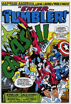
Splash page from “Enter…the Tumbler!!”
from Captain America Vol. 2

As promised, here is more Cap as only Jack Kirby could draw him!

On of my favorite stories in this series (Marvel Masterworks Captain America Vol. 2) was Enter…the Tumbler! This featured a previously unknown (and unused later on, as far as I know!) character with much of Cap’s acrobatic skills fighting him to a standstill. There was a nice twist to this story, though, that I won’t ruin here, but let’s just say that Cap fights back later on in the story in a big way!

Cap getting his head handed to him by the Tumbler

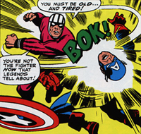
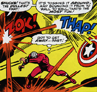
Cap getting his head handed to him in
“Enter…the Tumbler!!”
from Captain America Vol. 2

The story begins with the Tumbler totally (seemingly, you’ll know what I mean when you read this story!) kicking Cap’s butt! He actually wipes the place up with him and makes it look easy! See a full page of great Kirby action here.

Cap lays some Shield Magic on the Tumbler

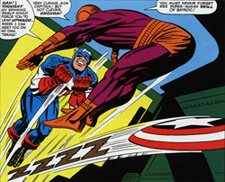
Cap lays some “Shield Magic”
on the Tumbler!!
from Captain America Vol. 2

But of course, later on the story, Cap comes back and lays some hurt on Mr. Tumbler, who wonders what hit him! See Cap’s comeback in another full page of Kirby magic here.

This story featured some truly awesome action sequences by the great Jack Kirby in the prime of his career on a character he created in the 1940’s. You could buy this book for this story alone!

Cap takes in too Batroc

Cap takes it to Batroc the Leaper!
from Captain America Vol. 2

Another of my favorite stories in this Marvel Masterworks volume is The Blitzkrieg of Batroc! This alliterative masterpiece, written by the great Stan Lee and drawn by Jack Kirby, again features ferocious action sequences with a great storyline featuring the mysterious Agent 13. This story, in my opinion, is the best Batroc story ever! Here, Batroc (Zee LeePair if you use zee fake French accent!) is indeed a match for Cap with his stunning leaping and acrobatic agility. This story also features the continuation of the budding Cap/Agent 13 romance that gives an extra dimension to an already great action-packed drama.

MODOK!

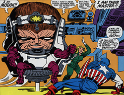
MODOK…Only a mother would love this guy!
from Captain America Vol. 2

Still another great storyline featured another great new villain from the fertile mind of Jack KirbyIf This Be…MODOK! It includes the great bad-guy spy ring known as A.I.M. (Advanced Idea Mechanics, for those of you wanting to be in the know) and this truly horrific new villain that only a mother could love. I still remember the first time I saw the grotesque form of MODOK as a kid. How could someone dream up such an ugly (and totally cool!) villain? To me, Marvel was the coolest comics company going. They had the best stories and the best art. There really was no comparison. And I think that it still shows that after all this time, (over 40 years!) these stories still rock!

Cap disappointed!

Don’t disappoint Cap!
Buy Marvel Masterworks
Captain America Vol. 2!

I could go on all day about this great collection of Captain America stories. Do yourself a favor…If you love Cap, go buy Marvel Masterworks Captain America Vol. 2. Do it! You wouldn’t want to disappoint Cap now, would you?