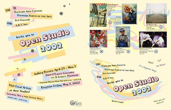
Hayward Arts Council Brochure, Pages 1 and 4
I really tried to make this a fun piece. I used a “bouncy–feeling” font that had lots of fun graphic ornaments in it. Pages 1 through 3 has distinctly different “brush strokey” graphics in the background, whereas page 4 has irregular geometric boxes as the background. But it still feels “whole” to me. The fonts, ornaments, and colors tie the whole piece together into a fun little “package”.
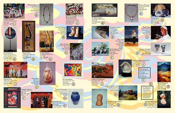
Hayward Arts Council Brochure, Pages 2 and 3
I love using light, pastel colors in the background of printed pieces so as not to clash with foreground elements.