Framing By Winton business identity (logo) and business card
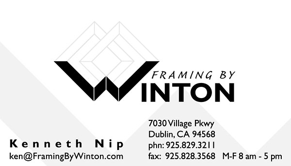
My approach to the business identity aspect of the project included accentuating the “W” of Winton into a series of “L” shapes, a natural for this business which deals with building frames. The “W” becomes part of two interlocking frames, which again reinforces the “framing” theme.
On the business card design, I made the frame outlines a bright silver foil to accentuate the shape and to be more eye–catching. A gray graphic shape, echoing the “W” shape, rounds out the design.